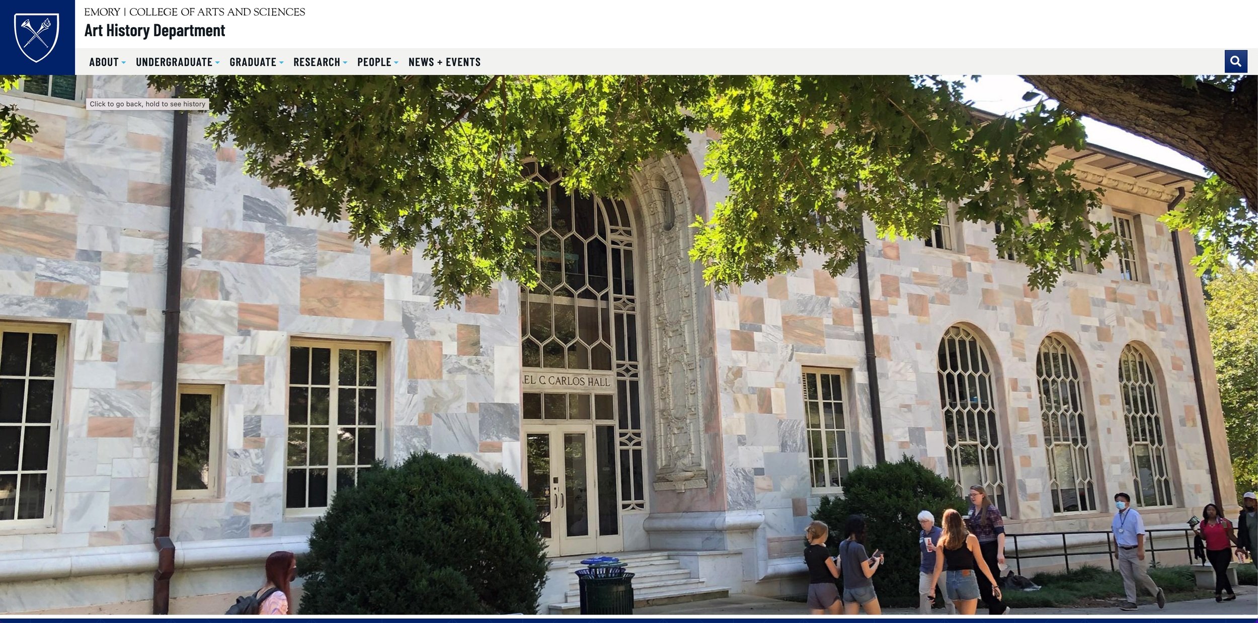
The Art History Department at Emory University asked me to lead the redesign of their website in conjunction with Emory’s Office of Communications. The site needed to better serve its users, more closely align with the brand identity of both the department and the university, and reflect a modern design sensibility.
In this project, I served as UX Researcher and Digital Project Manager. I was supported by Kizzy Williams, a Communications Specialist with the Office of Communications, and Marianne Schneider, a Senior Web Developer who incorporated the recommendations into the redesign.
UX Research Case Study:
Art History Department Redesign
The Process
-

Recon.
Assess other department websites through a competitive analysis. What do these sites emphasize? How do they present themselves?
-

Research.
Uncover the needs and behaviors of users. What brings users to the site? Are there distinct user journeys based on different user groups?
-

Recommend.
Explain findings to department and other stakeholders. Suggest changes based on research and work with Office of Communications to implement solutions.
Recon.

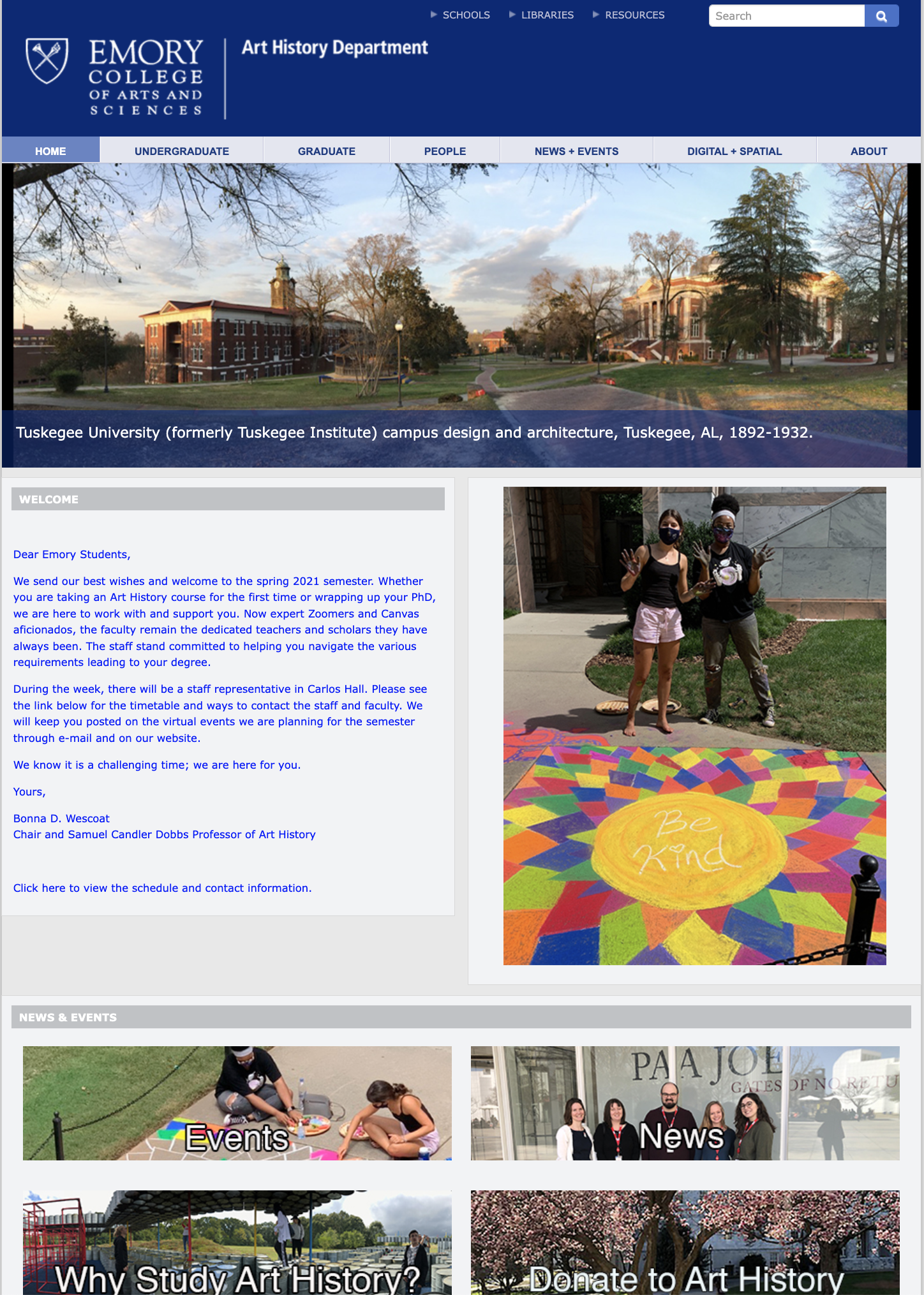
Emory Art History, March 2021

Emory History

Emory Chemistry

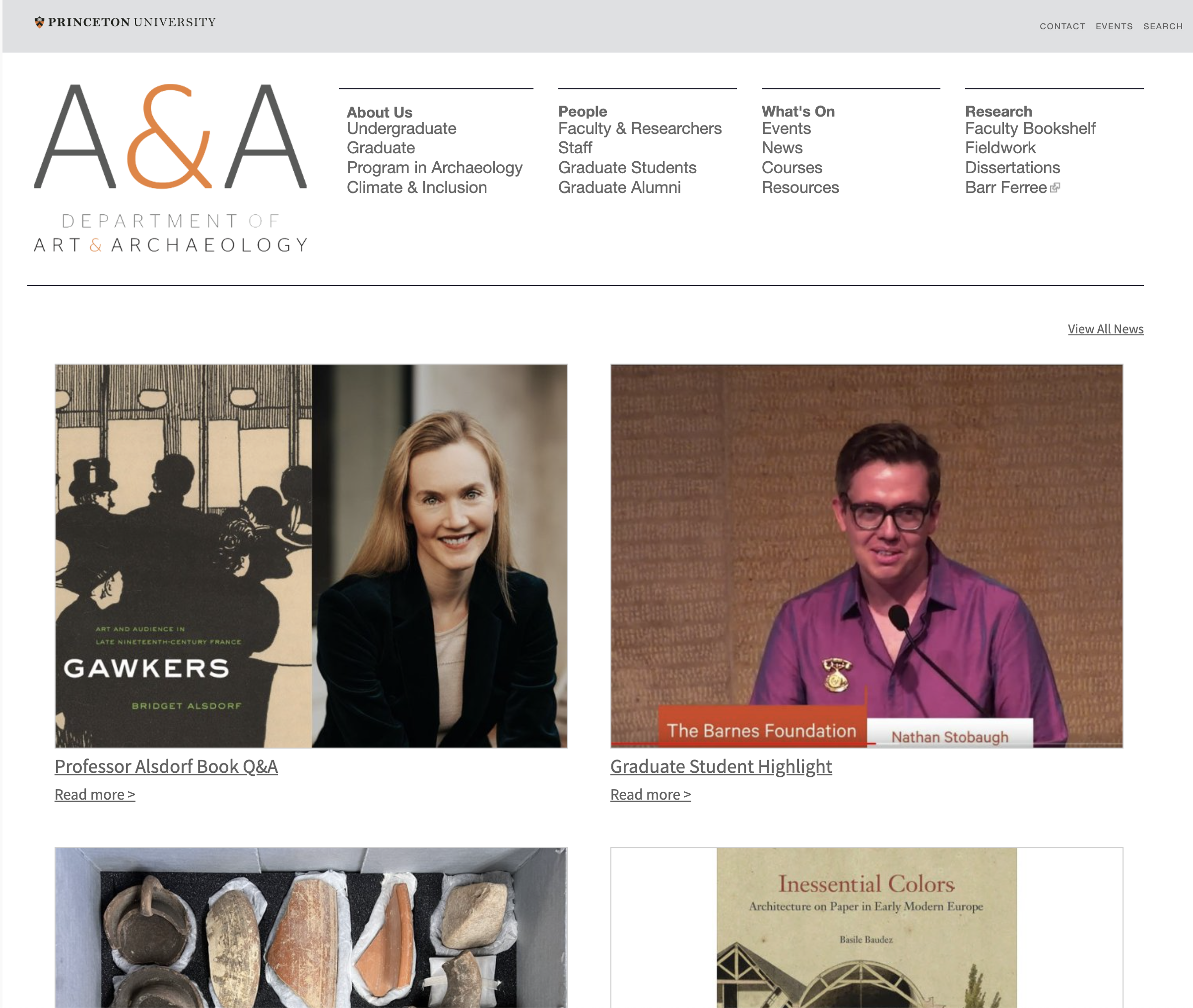
Princeton Art & Archaeology

Yale History of Art

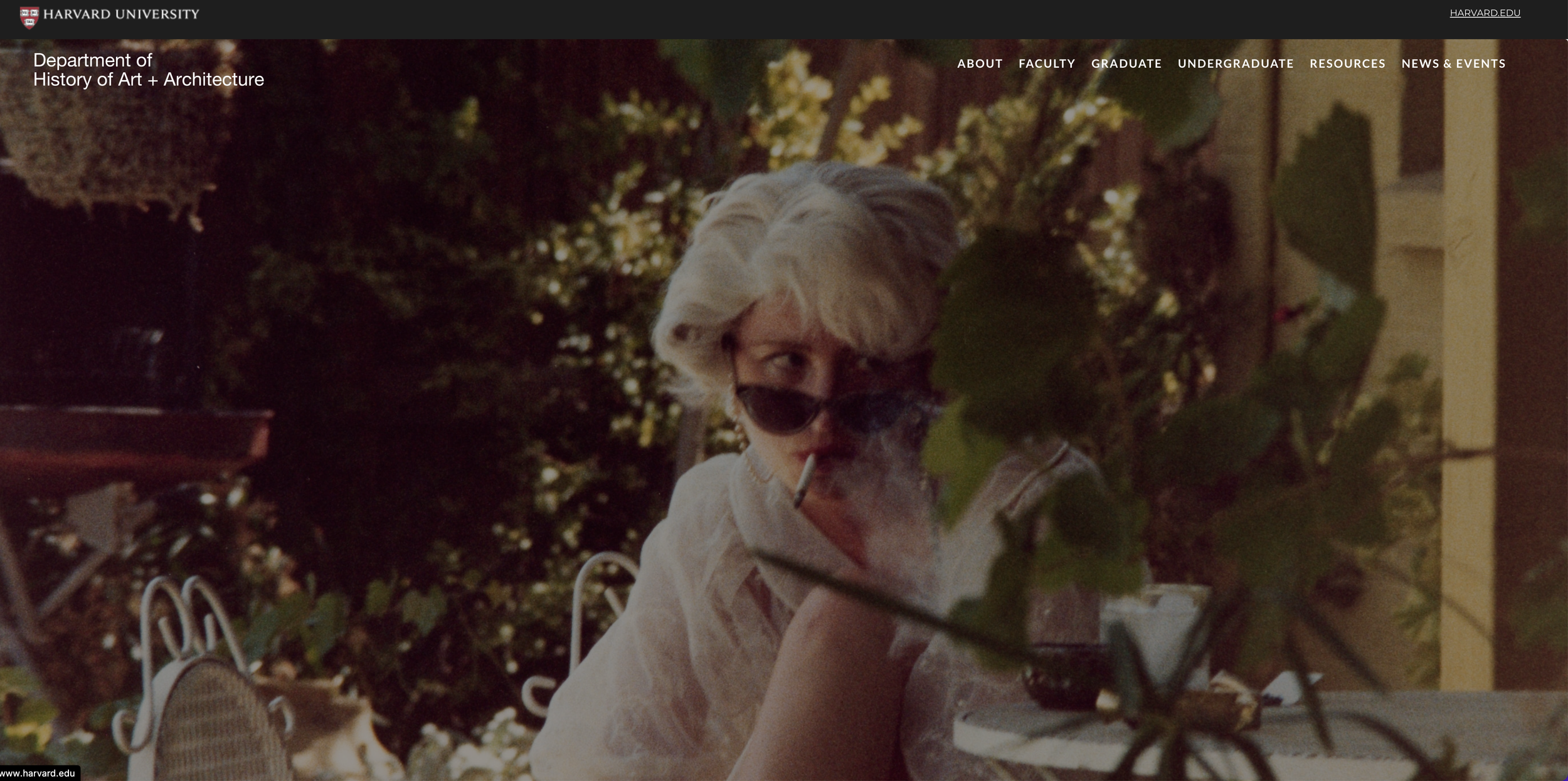
Harvard History of Art + Architecture
Early mockup of department homepage based on audit findings.
The redesign team of Kizzy Williams, Marianne Schneider, and myself, began by comparing five different sites in a competitive audit. These sites included two Emory departmental sites: Chemistry, which had already been updated by the Office of Communications, and History, which retained the old style from 2008. We also looked at three direct “competitors” in the art history department pages at Princeton, Yale, and Harvard.
We found that each site provided similar content, but chose to emphasize different aspects of their department. Harvard, for instance, highlighted opportunities to study abroad, while Princeton focused on faculty activities. We also found that department sites often included long blocks of text that made it difficult to read on mobile devices.
Ultimately, we generated two hypotheses: (1) that our redesign needed to be image-forward to reflect the nature of Art History; and (2) that users needed to be able to easily skim pages via headings and menus to rapidly find their desired information.
Research.
Primary Findings
-
Users seek out:
Faculty profiles
Program requirements
Upcoming events
-
Users do not frequent:
Undergraduate schedules
Past events
Graduate student news
I conducted 12 total user interviews with 3 representatives from department faculty, staff, undergraduate students, and graduate students. These interviews were designed to generate insight into what users felt about the current site and what they believed the new site needed to include.
We supplemented these user interviews with a content audit using data from Google Analytics. This audit allowed us deepen our understanding of user journeys and to identify which pages were most visited by external users. We defined external users as visitors to the website who were not directly associated with the Art History Department as faculty, staff, or students.
In our interviews, each user group emphasized the importance of pages that were directly relevant to them. Graduate students, for instance, expressed the need to locate program requirements and upcoming course schedules. Faculty believed the website should promote their work and attract prospective students who might become their advisees. Staff felt that each page was necessary to build out a picture of the department as a whole.
By comparing these findings to the content audit we were able to quickly see the limitations of a strictly qualitative approach. Site traffic data revealed that undergraduates did not utilize the site to access course schedules despite their heavy promotion on the front page. Similarly, very few users beyond the staff viewed information on past events or faculty awards. Perhaps most surprisingly, we found that while users were interested in the activities of graduate program alumni, they rarely visited the feed of graduate student news.
Findings table from team discussion in Miro.
Recommend.
Solutions based on research:


